Clay beautiful window – the no ordinary showroom
Design Notes: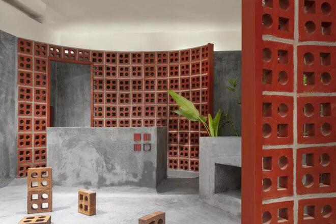
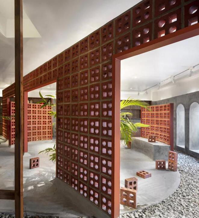
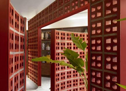
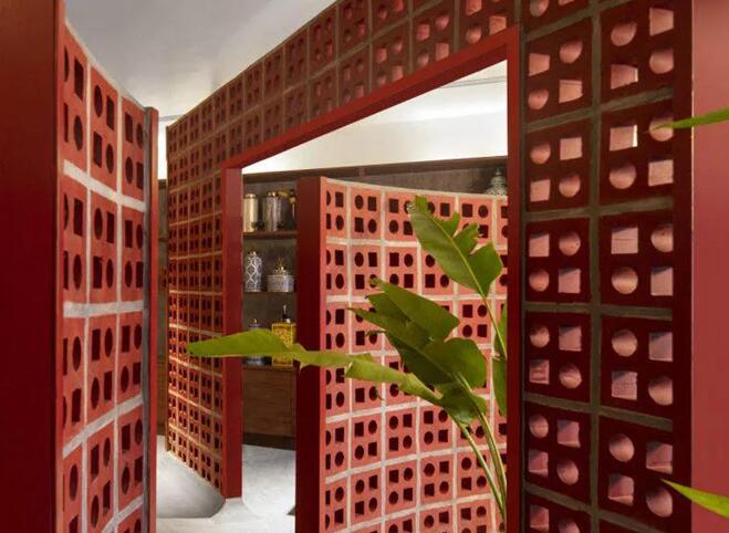
The showroom is surrounded by a rustic red terracotta brick, this is no ordinary showroom. The designer has only one simple goal when designing-to create a space that immediately feels comfortable and familiar, and attract people to this place. Avoiding the traditional exhibition hall method, the designer tries to display the space as a gallery, which provides consumers with the experience of viewing the product by displaying the product in an attractive environment. This design allows customers to interact with the product through the various pockets created and get a sense of its inner quality.
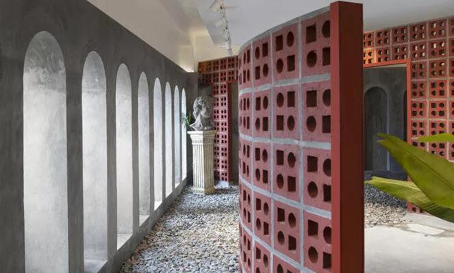
The project experimented with the concept of space, pushing the boundary of the showroom to a gallery, and sculptures and products became part of the design. The final concept avoids the idea of a layout that conforms to its shape, thereby eliminating and cutting the entire space, thus forming a manipulable pattern throughout the store. Simple curves and diagonal lines are scattered on the display.
These different shapes that form the spatial ideology analyze and revive the design, thus forming the framework of the product. Essentially, this is a home furnishing store, and the semi-enclosed volume provides multiple access points that overlap with the overall structure used as a gallery element. In terms of materials, the original concrete texture resonates with the terracotta bricks, forming a short space that can be managed like a gallery and a showroom. The natural color and texture changes found in the material scheme form a space that can be managed according to its product.
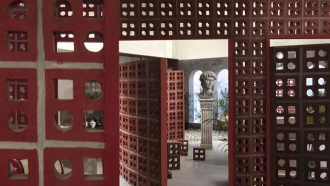
The main design focus is to create a primitive, destroyed feeling, which is like a gallery, in a state of constant change and experimentation. The visitor is brought into an organically formed path, but also carefully guided by the architect himself. The clay window shows its importance and adds value to contemporary aesthetics.
