The perfect match of red brick and art hotel
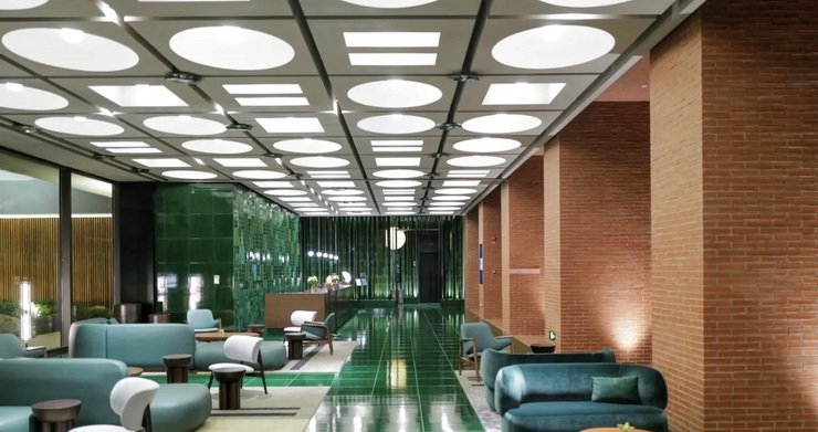
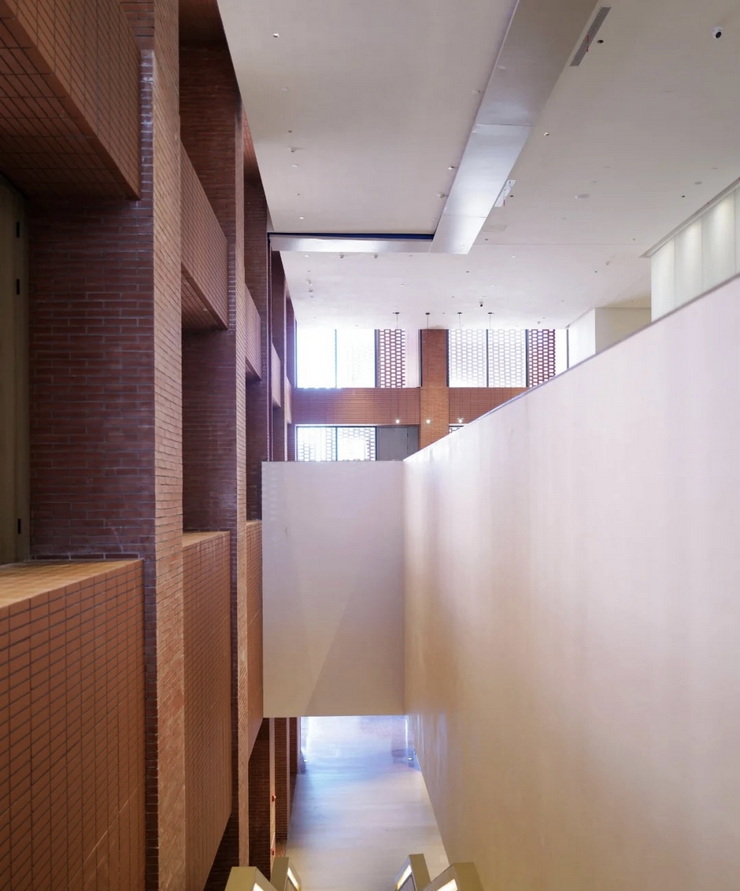
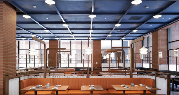
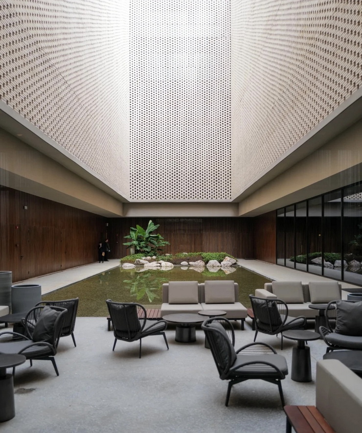
Design elements – red bricks, red bricks have been widely used since ancient times, and the terracotta bricks fired from clay are assembled to form a sometimes dense and light-transmitting facade, alluding to the solidity and light-transmitting of ceramics texture.
The front hall of the hotel – the kiln is the creative inspiration. The back-shaped top cover and the labyrinth-like bottom platform outline the boundary of the front hall. The leather cushions randomly placed on each edge of the platform, and the art installation extending on the inside of the platform to symbolize the clay is ingeniously balanced. And take into account the leisure function and artistic atmosphere of the front hall.
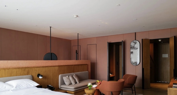
Guest room – like a collection of various terracotta used to create, continues the terracotta color of the public area and blends into gray. The layout of some VIP king-bed rooms is quite interesting. The entrance hall, cloakroom, toilet room and shower room are all separate spaces. As long as the sliding door is covered, it can magically integrate with the wall. The living room and bathroom of the VIP king room are divided into two by a low wall, showing the progressive beauty and pleasure of the space level.
Recreational facilities – complete and complete, although the hotel is exquisite in size, the gym does not care about the size and the configuration is unambiguous. The all-white tiles, courtyard and pool guarded by plenty of natural light are stunning. And I am also particularly fascinated by the wellness center reception hall with its two island counters.
