As the headquarters buildings of many enterprises have certain relationship with their business direction, this is a new headquarters office building. In order to meet the needs of the owners, the firm conducted a research on the land. The original office building was located in Wenlai-dong. In a condominium factory park, the typical problem is that the width and depth of the condominium factory are very large, the height of the ceiling is relatively low, and the working environment of the workers in the center of the commercial space is poor. After the renovation of the new building, its curtain wall design is more characteristic.
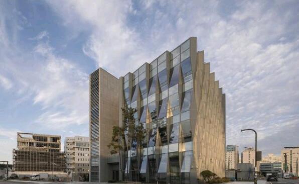
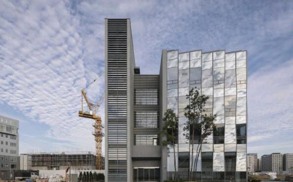
The site of the new building is located at the northeast corner of the crossroads, with the office building facing west and south, both of which are not good for office buildings. In addition, because the project is close to a large-scale factory site, the building looks extremely small. If there are disadvantages, there are advantages. The adjacent land is completely empty and there is almost no building. This condition gives the architect free space to play. The main feature of this building is the design of its curtain wall. The curtain wall designer combines the humanistic design method with local lighting.

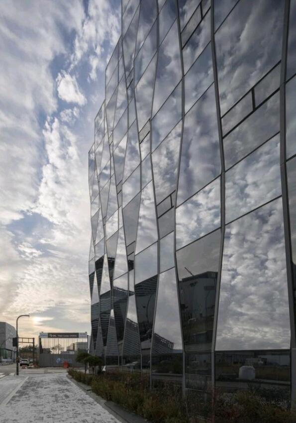
The design of the curtain wall of the headquarters building is also very rich in texture, and the materials of the curtain wall used in the facades with different orientations are also different. In order to prevent the intense sunlight from the southwest side in the afternoon, a series of hexagonal aluminum curtain walls were arranged in the southwest corner of the building, and then connected with the other glass curtain walls, so the glass curtain wall on the west facade faces the northwest direction, and The glass facade on the south facade faces southeast. Therefore, when looking at the building from the southwest side, the office building presents an origami-like sharp-angled form, while the folded form of the west facade and the south facade is completely symmetrical.
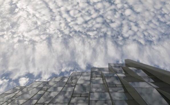
The graphic style presented on the building’s curtain wall is constantly changing according to sight, time and climatic conditions. The building’s appearance and origami-like skin will also produce varying images depending on where the audience is standing. In addition, when the aluminum curtain wall and glass curtain wall are in harmony with the sun and the sky, it will promote the effect of this change. Therefore, even the static design on the building will constantly generate new images according to the situation.

In order to make the internal space of the headquarters building look elegant and decent, in line with the temperament of a growing medium-sized company, the office divided the internal space into office and service areas. The second floor and the courtyards on the third and fourth floors connect the two. By connecting the outer atrium on the second floor and the courtyard on the fourth floor, the office provides external lounge space on each floor. In addition, by reducing the depth of the space, increasing the height of the ceiling, and arranging the internal space facing the atrium and courtyard, the staff will feel sufficient openness no matter where they are located.
Therefore, the design concept of the curved curtain wall is fully humane.
